
Naviance scatters students’ perceptions on college
On Naviance, a college and career preparation website used by WCHS, students can see where they fall on an SAT/ACT score and GPA scattergram. Not only do these graphs make students feel a sense of inferior, they are also an inaccurate representation of what is needed to get into that college.
December 9, 2022
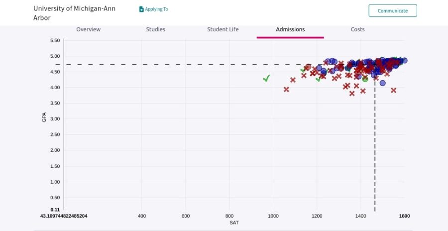
A 1430 SAT and 4.61 weighted GPA. 1540 and 4.74 weighted. Both are marked on the University of Michigan-Ann Arbor scattergram for WCHS applicants. Who got in? Who got rejected?
Why would someone with lower scores get in over someone with higher scores? Short answer: college admission process involves so much more than just the grades and the test scores of applicants. GPA and SAT/ACT scores are just one part of college admission decisions.
Naviance is the common college and career software used throughout MCPS. It is the platform on which teacher and counselor recommendations along with transcripts are sent during the college application process and is used frequently throughout high school for career-oriented activities. When a specific university is searched, the student is provided with a plethora of information about the school, including a WCHS-specific scattergram of past applicants.
On these scattergrams, students are plotted based on their GPA and SAT/ACT score, with a check mark meaning accepted, a red X for rejected and colored circles for those put on a waitlist. In addition, Naviance places the student logged in on the graph with their current test scores and GPA. There is no doubt that Naviance provides students with much-needed information about colleges, but their scattergrams are not helpful in determining the likelihood of acceptance to universities. Instead, they do nothing but perpetuate the wrong idea that students’ grades and scores are what get them accepted into universities.
In reality, these charts do not accurately reflect an applicant’s full abilities or chances of getting into a certain school. Scattergrams fail to recognize the importance of a personal essay, supplemental essays, extracurriculars, class rigor and positive upward trends regarding grades.
Activity lists filled with community service outreach, a clear interest in a specific field, leadership experience, varsity sports or work experience are additional major factors that admission counselors look at. Colleges are not only looking for academically strong applicants, but also those who can better their college’s community. That can not be quantified on a graph.
Scattergrams also do not address one of the most tedious parts of applications: the essays. Whether it is the universal personal statement or school-specific supplemental essays, colleges want to learn more about the applicant and what they can contribute to the campus. Fantastic grades and a nearly perfect test score can be negated with a poor essay.. There is no perfect science to getting in or not to a university, and the act of taking only two aspects of one’s application into account and plotting it is useless.
Nevertheless, scattergrams can be good projections for how many students usually get accepted and can give applicants a view of the average grades and scores of an admitted student. But, the entire premise of a scattergram can be extremely demoralizing for students. Seeing their scores in a sea of Xs with only a few checkmarks can be discouraging, especially when it is a school they already know is competitive among WCHS students.
College prep websites, like Naviance, should stop using scattergrams to represent schoolwide data. There is no accurate way to represent the chance an applicant has of getting accepted into a college. Instead of using scattergrams, presenting the information of the average GPA or standardized test score of the university would provide prospective students with the same information in a less aggressive and comparative way.
The college process is already anxiety-inducing and stressful enough as it is, do we really need to make students feel like data points?